
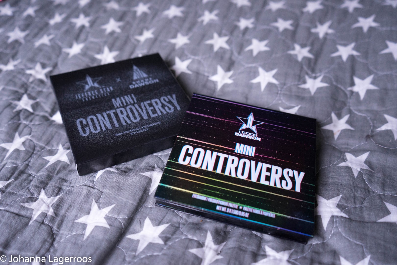
Today's post is something I didn't even dream of being able to do this quickly but lucky for us my boyfriend is an MVP and manage to get his hands on the Shane Dawson Mini Controversy Palette that Shane released in collaboration with Jeffree Star Cosmetics (in case your not familiar in happenings of the beauty world for some reason). So today, we're diving into the palette and talking about my first impressions with it. As for the bigger palette, I'll cover that one once my order arrives, which could take a week or two taken how many orders they have to process. And like you may have gathered in social media and/or trying to buy the products yourself, the launch was an apocalypse. But apparently I managed to grab things for me and my bestie, which is amazing and I'm especially stoked I could get her something she has waited forever even though it was stressful and made me broke.
Anyway, let's talk about the one thing I do have already:
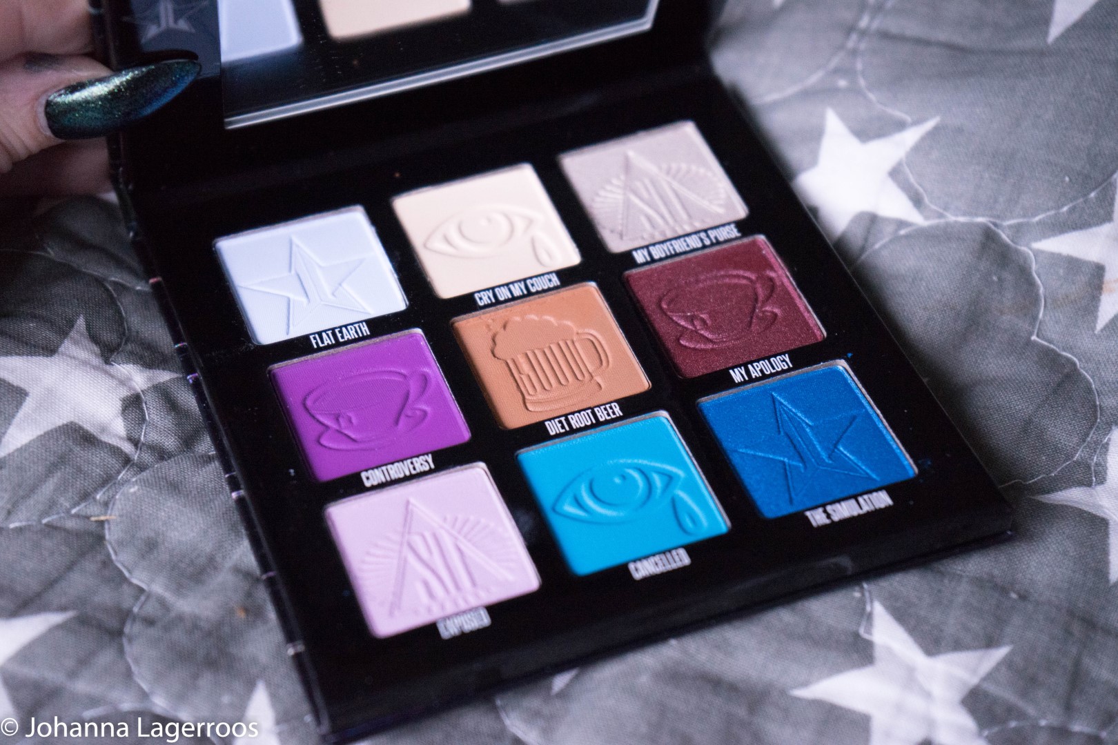
The color scheme of this little palette is very up my alley, I like Jeffree's - and in this case, Shane's too - ability to build palettes that have a nice balance of neutrals and brights so that one palette can be used for a great variety of looks. As a person who tries to create a different look each day, that is an amazing aspect in a palette. I also think that each of the shades in this one go together quite seamlessly, so this is an easy palette even for beginners.
The palette consists of eyeshadows and pressed pigments, which means some shades may prefer to be packed and blended rather than layered, which is the reality with all Jeffree's palettes and the reason some people find them difficult to work with. My tip would be to have an unset/bit sticky base to start with if you find a shade hard to work with, packing it to the vibrancy you want it to be and then starting to blend its edges with a lighter shade, but carefully little by little to avoid patchiness. Little trial and error goes a long way when learning to do makeup and use new shades.
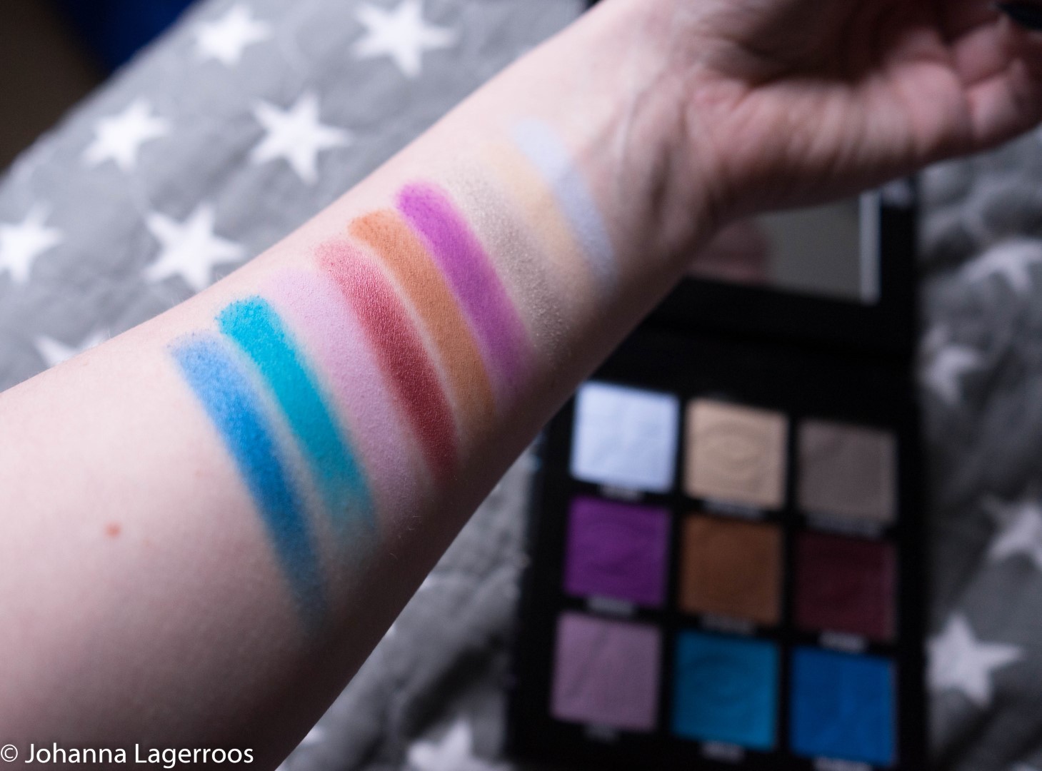
Here you can see all the shades swatched on my arm. The swatches are finger swatches and have been swiped one to three times to make the colors pop as much as they can. So this does not give you the truth about how the shades act with actual use, with a brush and so on, but that I'll cover later in this post with actual eye looks. At the first swatches, I was especially fond of the shade My Apology, which is the maroon shimmer there. It looks stunning both in photos and in real life, and it's such a perfect shade to release on holiday season. I was also very impressed by how all the shades swatched, none of them seemed very dry or patchy, and they were all very pigmented.
But the true test was how the shades would perform in an actual look because that's all that truly matters to me.
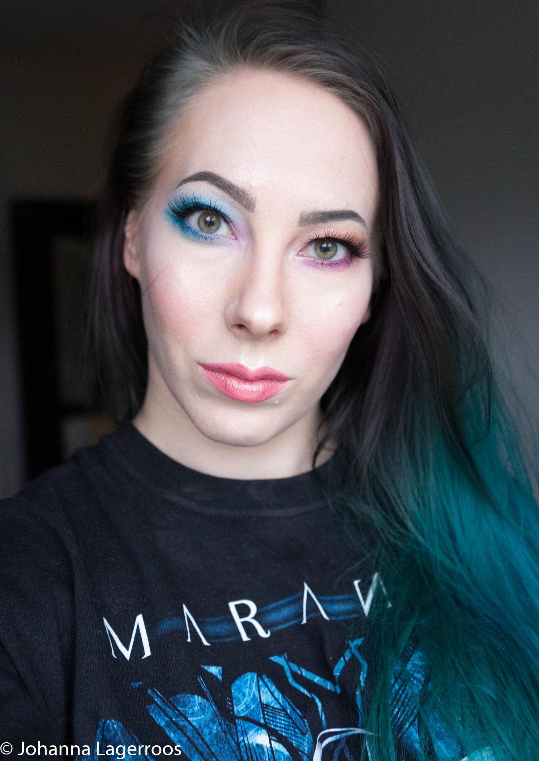
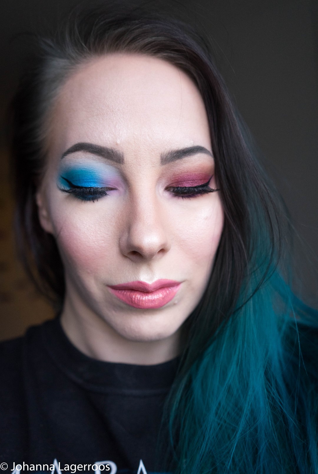


So I went overboard and tried every shade on my eyes, blues on my right one and purple and browns on my left one. With you, they obviously show another way around. This look would've been fun to wear out and freak people out, but unfortunately, I had nowhere to go with this face. As you can see, the shades of blue are super vibrant, which for a vegan formula is such an achievement but we've come a long way with makeup in the near future. And as for the brown side, I feel I created a wearable but fun look with the purple lower lashline. Below, you can see each of the eyelooks on their own for a more detailed review.


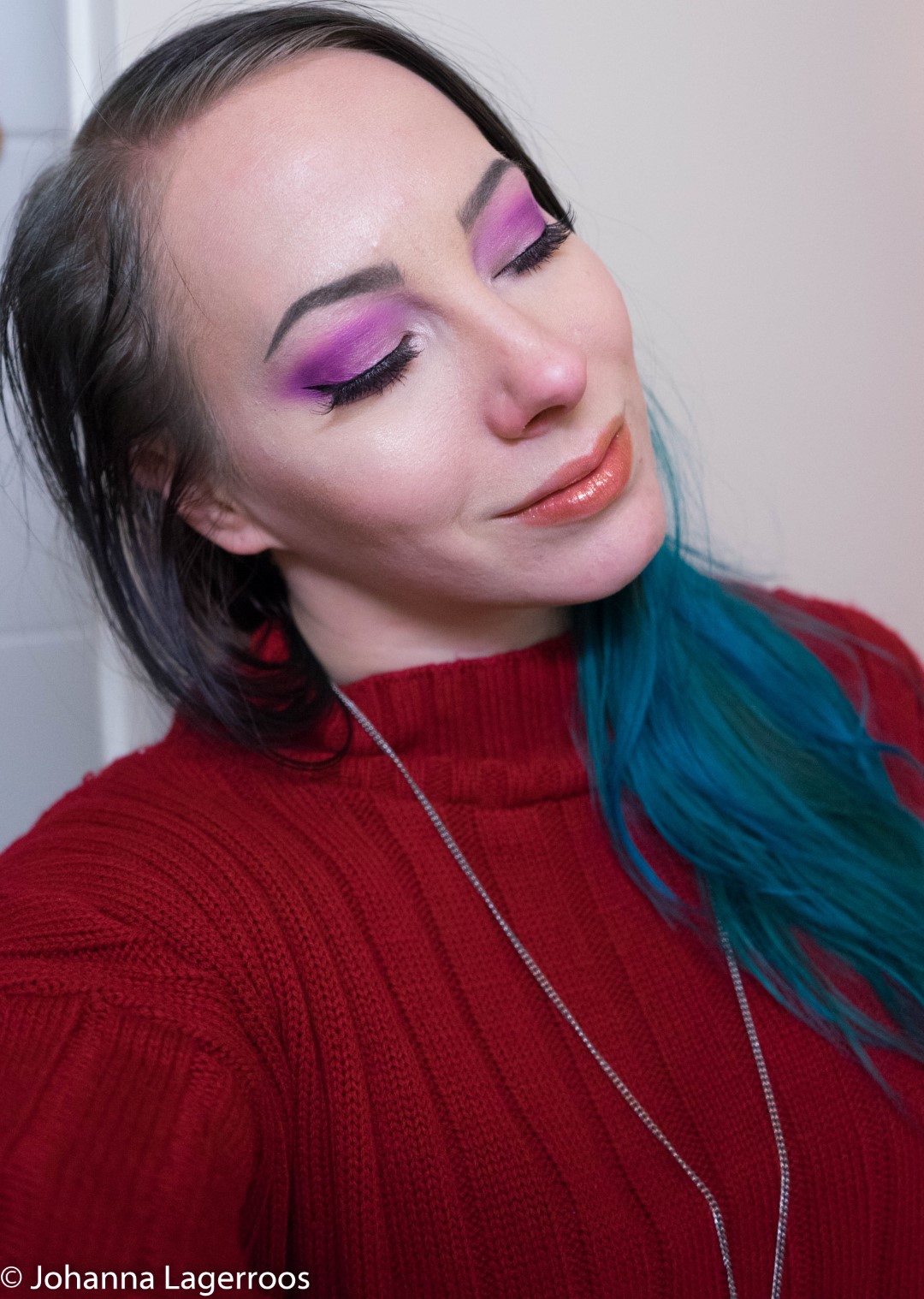
Let's start with the brown one. This one was trickier to photograph since I never really capture this side as my eye on this side is a bit lazier in the outer corner than the other one. While I'm not bothered by it and I think it's still cute, it doesn't photograph as nicely as the other one. Anyway, that's not the point, you're here to hear the tea about the makeup. For this eye I used the shades Cry On My Couch, My Boyfriend's Purse, Diet Root Beer, Controversy and My Apology.
To get this look, I started by packing Diet Root Beer on my crease, blended its outer edges with Cry On My Couch, then added My Apology all over the lid, packing it bit with a finger for maximum shimmer. Then I took Controversy and used it to deepen the outer corner and lined my lower lash line with it. Lastly, I took My Boyfriend's purse to light up the inner corner.
Working with all these shades was very effortless, as they are easy to blend but also pigmented so one can pack them really nicely. Diet Root Beer is one of the prettiest browns I've ever tried and seemed like you can build it up little by little to the intensity you prefer. Cry On My Couch is a good basic beige in a light yellowish tone, and where I can't ever hype this basic shades to the skies, it is a good staple shade if one likes neutral looks, and especially for lighter skin tones, it's a really good blending shade. My Apology is a beautiful maroon shimmer, and it has quite a bit of red to it as a lovely maroon should. However, if you prefer your browns cooler or neutral, it might not be your cup of tea. Personally, I love it a lot, I like my neutrals more red toned. Like Jeffree's shimmers usually, this one is very creamy and nice to work with, and I personally like to help them pop more with the help of my finger. Controversy was the shade I expected to have a bit more work with, because purples are notoriously tricky to perfect, especially with vegan formula. At first, I did think it's a bit patchy, to be honest, but the issue was my applying method rather than the formula. This purple gives the best results packed, not layered, so if you were to experience trouble with this, try patting instead of swiping it on. That should make it work - as I will show later in this post. And then, My Boyfriend's Purse, which is a light golden shimmer in a cool tone, and while it did look really nice in my inner corner and all, I think this would look the most popping and amazing on a deeper skin tone. I could also imagine someone making this work as a highlighter.


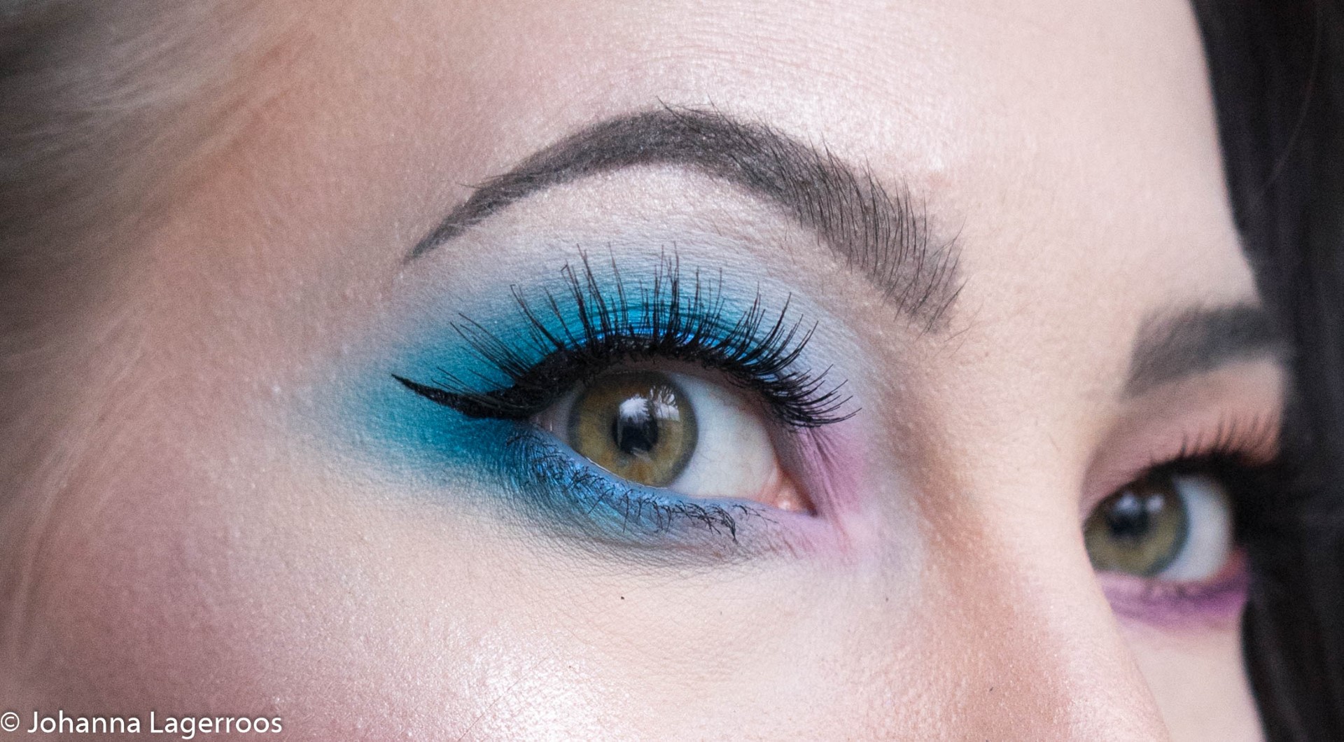

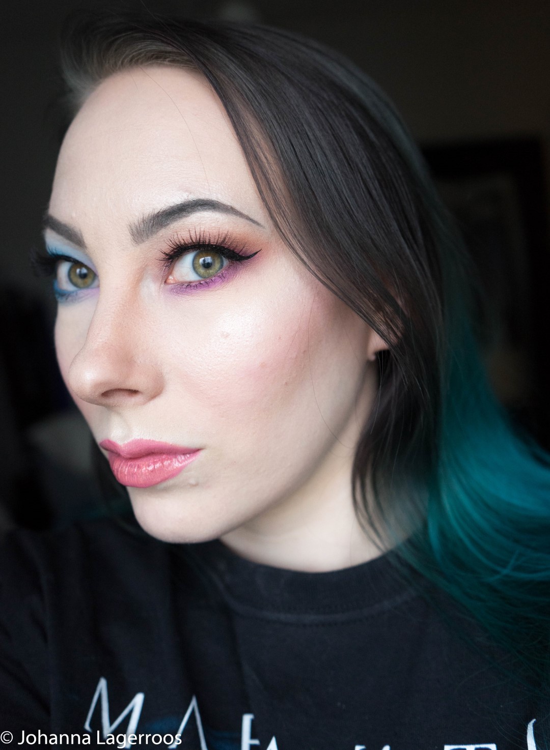
For this look, I went all-in with the shades of blue and added the pink/lavender for a pop of color. After Blue Blood Palette, I'm very comfortable with working with blues so for me, this was a no-brainer. If you are a little more unfamiliar with how to work blues, I can walk you through this look. The shades I used were Flat Earth, Exposed, Cancelled and The Simulation.
This look I started by packing Cancelled to the outer corner and the crease as well as outer half of the lower lashline. Cancelled seems like it's possibly a pressed pigment because it swatches tricky even with a finger but packs up stunningly. But since it is a slightly turquoise blue, I knew to expect that. After that, I blended the outer edges of it with Flat Earth that is a very light greyish blue. It's a shade I don't think I've ever come across in a palette and it does seem very unique. It's easy to work with and my only little thing about it is that it can possibly turn a bit ashy when added to the wrong spot, but then again some people like that vibe so it's not necessarily a bad thing. Then I took the blue shimmer, The Simulation, and added it all over the lid apart from the inner corner. This shade reminds me of Deceased from the Blue Blood Palette, and they both work quite similarly - and neither really is my favorite formula out there. I've yet to find out how to get the maximum potential out of this formula, but I'm guessing a wet brush might do the trick? (If you know, tips are more than welcome!) After that I took the shade Exposed, that is a lovely lavender kind of pink with a hint of lilac (or lilac with a hint of pink, depending on your philosophy), and made the whole inner corner pink because I thought it brings some fun into the otherwise completely blue look.
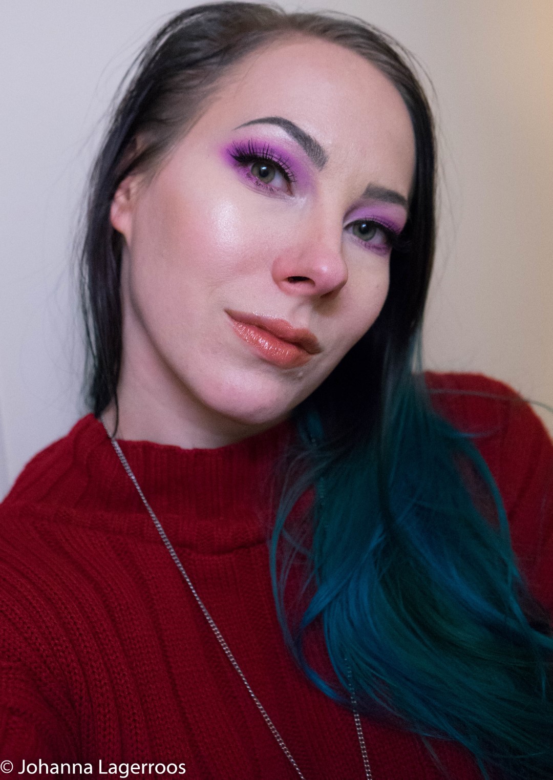

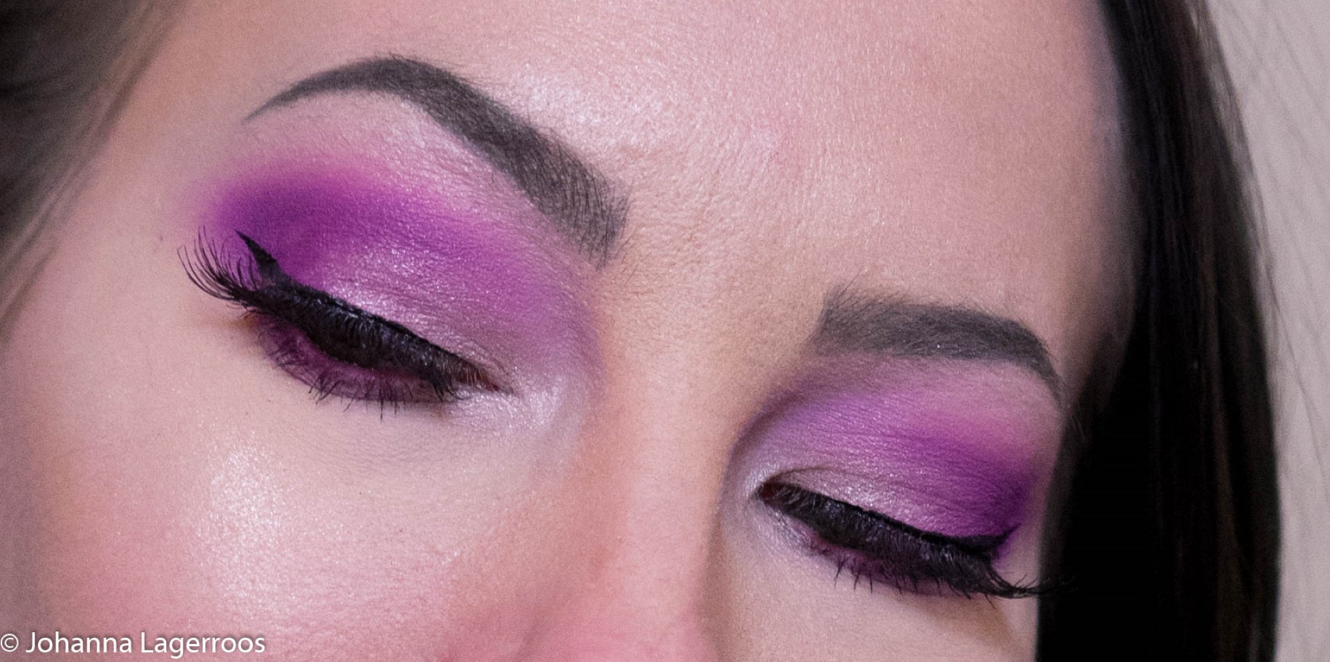
Lastly, I gave another shot for the Controversy. This time, I made sure to start by packing it on my outer corner and outer part of the lower lashline. Then I blended the edges with Exposed to create this soft purple look, and after that took My Boyfriend's Purse to add more shimmer in the look. For the inner corner, I also added some Ice Cold Skin Frost by Jeffree Star Cosmetics to get some extra brightness there. In this look, the purple performed like a dream which I was happy to see because it confirmed my thought that I had just used it wrong before. So that goes to show that before you absolutely bash a formula or a product, take a minute to try it a little differently and it might surprise you.

So is this one worth the money? This one costs 28 USD in the Jeffree Star website and US sellers it seems, but for example, in Finland, it sells for 34,90 EUR (nearly 39 USD). For the US price, 9 shades is very reasonable, just a bit over 3 dollars per shade and since the quality is there, I'd say it's a deal. For the Finland price, I'd still buy it, but I totally get if for someone that seems to steep for what you get. If you are one who needs a darker matte to make a whole look, this might not be your first choice since it doesn't go deeper than medium in any shade. For a person who would like to start trying out brighter colors and already has their go-to neutral palette, this might be a really good fit since the palette is easy to mix and match together. For someone who has tons and tons of makeup, this might not bring that much new to the table even though especially Flat Earth, Diet Root Beer and My Apology seem really unique to my eyes. To me, it's worth the money just for being Jeffree quality (as well as cruelty-free and vegan), but you have to make your own mind after my review as well as other sources that are available.
So what are your thoughts about this palette? Share them in the comments!
This became quite a bit longer one than I imagined but I had a lot to say to get all my thoughts out there. I wanted to sleep a night or two over my initial thoughts so that I can give you the most informed first impression I can because it's not so much to be the first to cover something, but rather to try to do it in a useful way. If you still have questions about the palette, you can either leave a comment here or on Instagram (@silvertigo), or you can DM me in any of my socials. The next post will be up on Wednesday unless I feel super inspired and have the time to cook up one for tomorrow, but in the meantime, I will be active on social media, so head on there if you want to see more. I'll see you in my next post.
Have a wonderful day ♥


No comments
Thank you for taking the time to leave a comment for me. I always read every single one of them, and they truly make my day! Please remember to be nice while commenting, thank you! ♥
You can comment in following languages (as these are the ones I understand):
English, Swedish, Finnish, Spanish, German
xoxo ♥